A new day dawned with the same cold start that has been the hallmark of this week. Folk here are pretty upset about how bizarre their weather has been of late. There has been a strange system stalled around here which has lead to some very high highs and some very low lows. None of it appreciated.
Nowhere else would people complain about 65 degree weather in February, but when they had a high of 18.2 °C (64.76 °F)in Wales a few days ago there were complaints aplenty! Me, I came dressed for crappy Wisconsin weather, so I just get another layer out of the closet and get on with it.
This morning took me to St. Pancras station to confirm a return ticket on First Capital for Gatwick on 3 Mar. I tried to do this online but it is not possible. They start out by asking your country of residence, so I picked US from the menu. Then they give you a form to fill out and one of the required fields is “Postal Code” and it will only accept UK postal codes. Go figure.
After leaving St. Pan’s I went west to the other St. Pan’s; St. Pancras Church. I went to see an exhibit of cartography called “The Island – London Series” by Stephen Walker. I am not quite sure where to begin with this exhibit. I guess I’ll start with the setting. This is exhibited in the crypt of St. Pancras. Although the current structure dates only from 1819-22, the parish goes back at least 600 years, and is thought to be one of the oldest Christian worships in Great Britian. The current crypt hasn’t been used for burial purposes for quite some time, and the markers are rather unceremoniously been laid up in a pile in one corner.
The work itself is impressive. Mr. Walker has fashioned hand drawn maps of the entire London area, and I don’t mean the kind of cartoon map that Saul Steinberg made iconic in 1976 with his “View of the World from 9th Avenue”:
“
No, these are detailed yet hand drawn maps, well a map, and several sections of it. How to explain…

The original is about 200 cm. x 400 cm. and is so tightly packed with information that you need a magnifying glass to even begin to penetrate the detail. Thankfully you are handed one at the door. Then there are the sections. There are over 40 of these, each overlaps its neighbours and provides the same information as the comprehensive map, but in more readable format.
The conceit of the whole piece is London as an island (hence the title) and it is well executed. Red Groom would blush at what this young artist has done, but has nothing to fear from him in terms of illustration. The whole piece is a triumph of wit and execution, but whether it is a great artistic accomplishment will await the judgement of more critical eyes than mine. I enjoyed it, but I doubt that it is Great. That is my verdict. I will say this: If Mr. Walker does not succeed it will not be for lack of effort on his behalf by TAG; my entire visit was serenaded by the lilting tone of his very efficacious agent on his mobile trying to get various influential collectors in to view this “very important” show.
I bought the catalogue if anyone cares to see it.
Next up was a horse of a different colour, as they say. Down to the Tate British, off of Millbank. The big shows right now are “Peter Doig”:

and “Modern Painters – The Camden Town Group”:

The Camden Town bit was what one would expect. A lot of copy-cat pieces inspired by the work ongoing in France at the time, but with a gritty English tilt. I don’t mean this too sound as dismissive as it does. I really wasn’t aware of the art of these chaps, Spencer Gore, Charles Ginner, Harold Gilman, Walter Richard Sickert, William Ratcliffe and Robert Bevan key among them. But, there is little here to recommend the school as more than an echo of what was happening on the continent. There is one important element, which is Sickert’s work in illustrating a sex and murder scandal of the late 1890s which broke new ground with art as a commentary on news. We still hear reverberations of this today in everything from Blueman and Jenny Holtzer, and before them Weegee and his bretherin.
The Doig exhibit, on the other hand, presented something which we haven’t seen before, at least not in just this form. Though his work seems heavily influenced by the work of Francis Bacon, David Hockney and Ed Paschke, it is both new and descendent. Doig tends to work in large canvases, like those three, and he uses parts of each of their techniques. From Paschke he draws the skill of over-painting the scene in such a way that he obscures almost the enitirety of it yet manages to lose nothing. To see what I mean, consider this piece of Paschke’s, “Blanco” from 1992:

In this piece, as with his others, Paschke has distilled the image down to that which we need to construct a face with which, even if we are not comfortable, we at least associate.
Now consider one by Hockney:

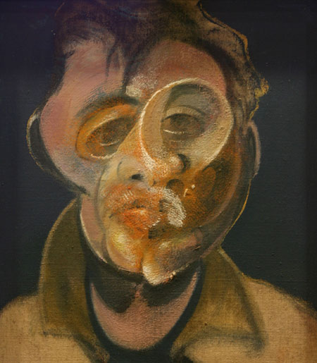
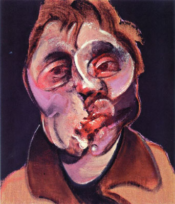
Now a pair of pieces by Bacon:
Lastly a piece by Doig:

Am I the only one who sees a progression here?
Thanks for putting up with my little art appreciation course. Sorry if I went overboard there…
I will follow up tomorrow morn with more photos from the day.
Ta!